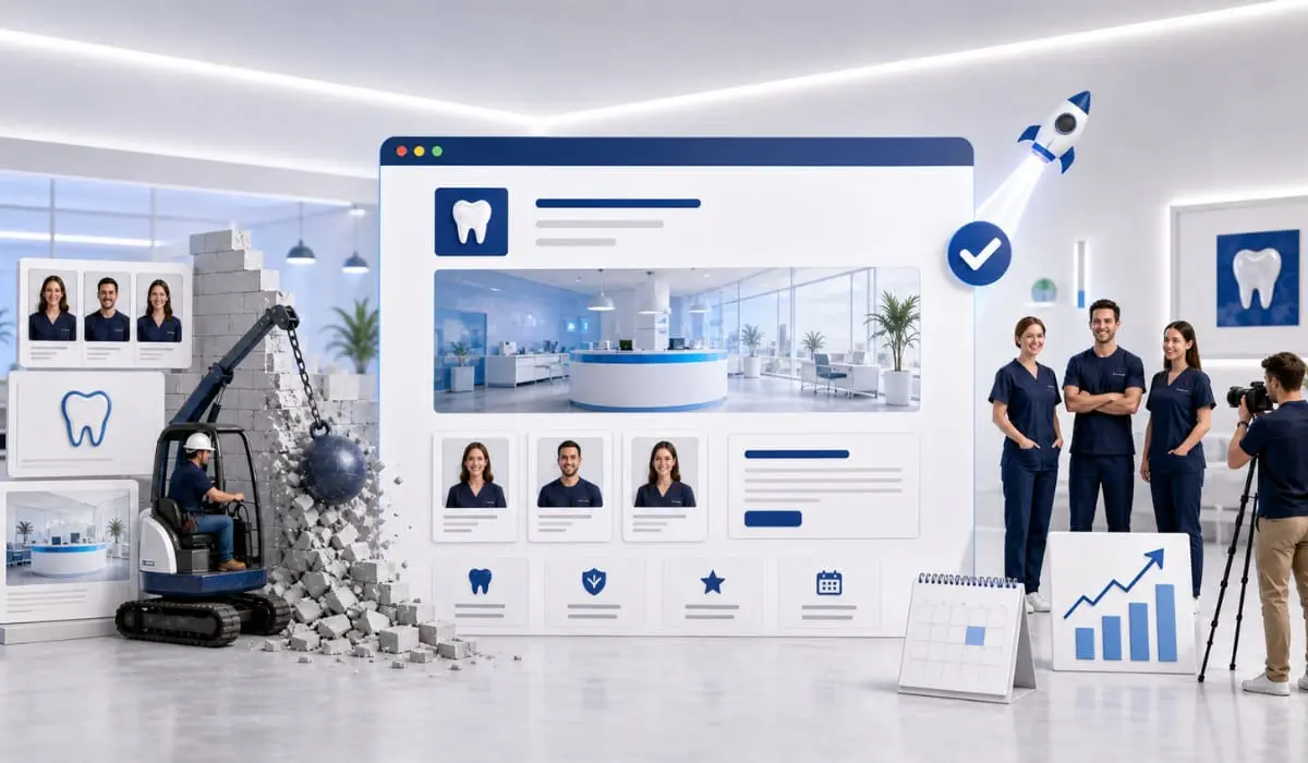
When a potential patient lands on your dental practice’s homepage, you have about three seconds to convince them to stay. If your site is cluttered, confusing, or hard to navigate, they will simply click the “back” button and visit the dentist down the street.
Your website is your digital front door. It doesn’t just need to look good; it needs to be incredibly easy to use. Let’s look at three practical user experience (UX) design tweaks you can make to your homepage to stop losing traffic and start booking more appointments.
1. Make Your “Call to Action” Impossible to Miss
The primary goal of your website is to get patients to schedule an appointment. Do not make them hunt for your phone number or the scheduling link.
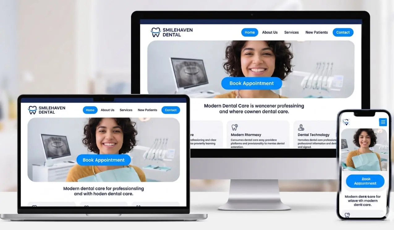
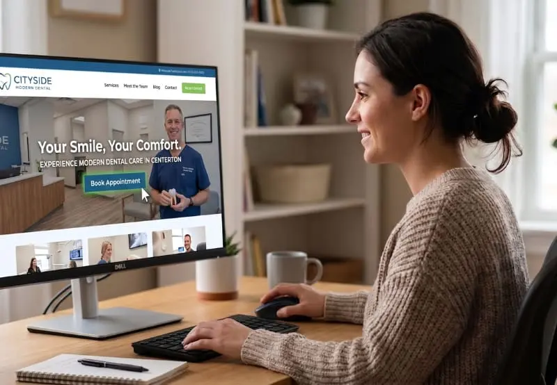
Your main “Call to Action” (CTA)—usually a “Book Appointment” or “Call Now” button—should be prominently displayed in the top right corner of your website’s header. It should also be front-and-center “above the fold” (the area a user immediately sees on their screen before having to scroll down). Make sure this button uses a contrasting color to the rest of your site’s branding so it instantly draws the eye.

2. Simplify Your Navigation Menu
A common mistake we see on dental websites is jamming a dozen different items into the main navigation menu. Overwhelming visitors with too many choices leads to decision fatigue, which causes frustration.
Keep your top menu clean and straightforward. Limit it to five or six essential tabs, such as: Home, About Us, Services, New Patients, and Contact. If you have an extensive list of specific treatments (like Invisalign, Dental Implants, or Teeth Whitening), group them cleanly under a single “Services” drop-down menu. A streamlined navigation bar guides patients exactly where they need to go without the friction of endless searching.
3. Prioritize a Mobile-First Experience
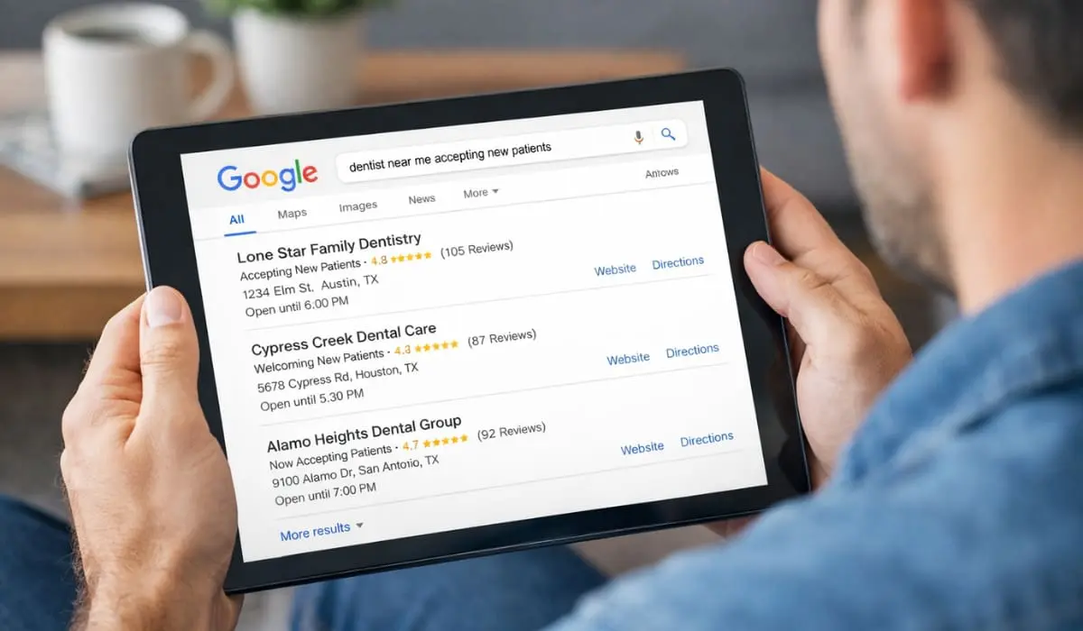
More than half of your website traffic likely comes from people searching on their smartphones. If your homepage looks great on a desktop monitor but requires pinching and zooming on a mobile screen, you are actively losing patients.
A modern UX design must be fully responsive, meaning it adapts seamlessly to any screen size. For mobile users, it is crucial to ensure your phone number is a “click-to-call” link. Nobody wants to memorize a ten-digit number to manually type it into their phone’s keypad. Additionally, ensure your text is large enough to read easily on small screens and that your buttons are spaced well enough to be tapped with a thumb.

Ready to Upgrade Your Online Front Door?
Your homepage doesn’t need to be overly complicated; it just needs to serve your patients’ needs efficiently. By making these three straightforward design tweaks, you will create a welcoming, frictionless experience that turns casual website visitors into loyal patients sitting in your chair.
Want to ensure your website is set up to capture every possible lead? The team at Bullseye Media is here to help you optimize your digital presence. Reach out to us today to learn more!