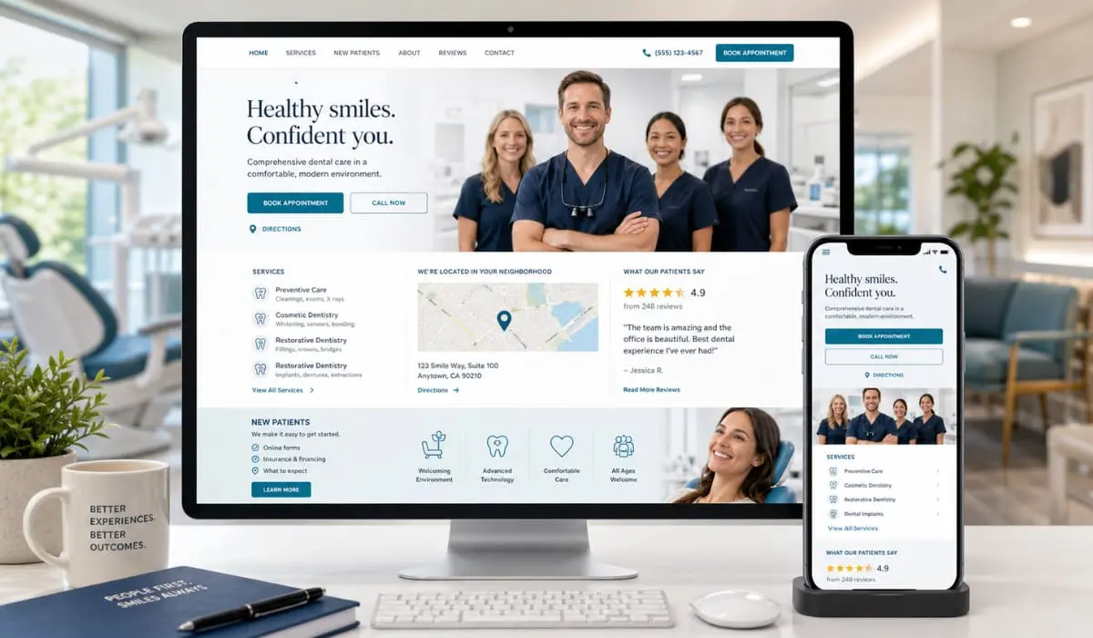
A dental website is not just an online brochure. For most patients, it is their first experience of your brand, long before they call or book. If the site feels confusing, slow, or generic, they click away and try the next practice.
Bullseye has been building websites and managing online marketing for more than 350 dental practices across North America. That experience shows the same patterns again and again. The best sites are not the fanciest. They are the ones patients actually use.
Below are practical lessons from those sites that you can apply to your own.
1. Answer “who, what, where” in a few seconds
When a new visitor lands on your home page, they are silently asking three questions:
- Who are you
- What do you do
- Where are you
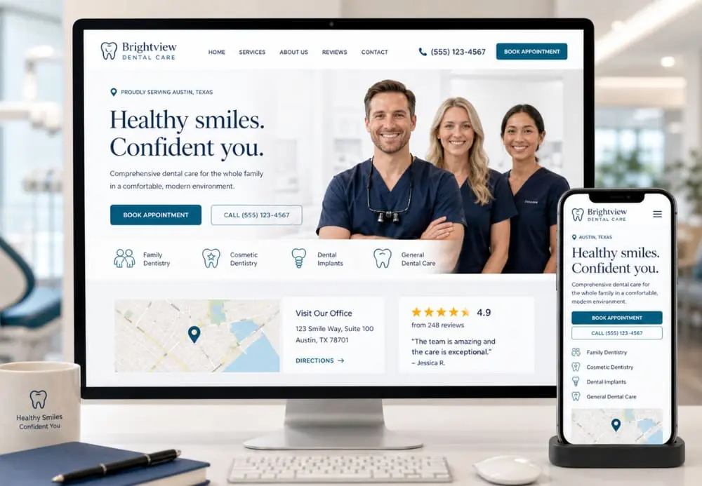
High performing dental websites make the answers obvious without scrolling. The header and hero section show your name, location, and core services. There is a clear call to action to call or request an appointment, and the design feels modern and professional, not cluttered or dated. (Growth Friday)
If someone has to hunt for your phone number or wonder whether you see patients like them, the design is already working against you.
2. Design for mobile first, not as an afterthought
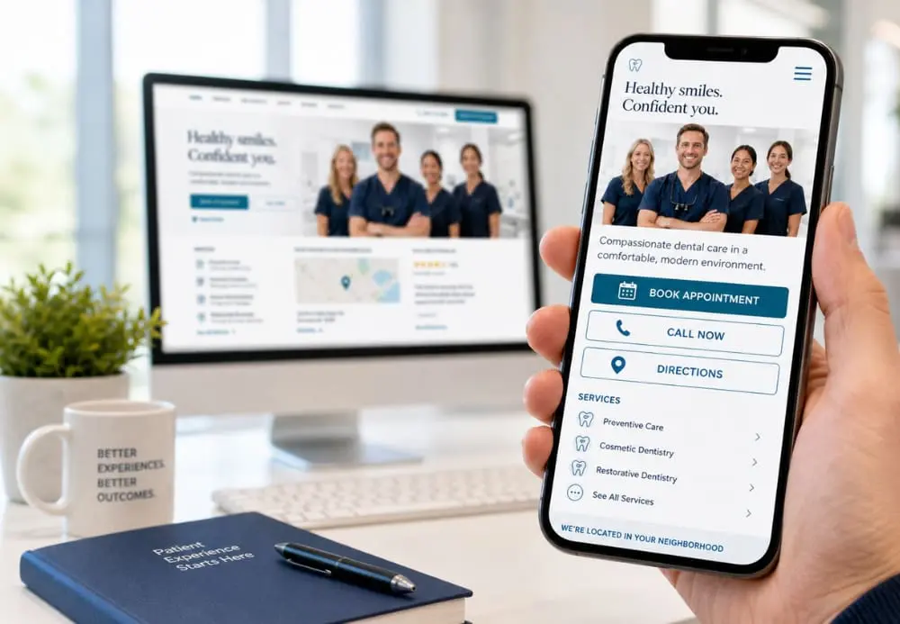
Most patients will first visit your site on a phone. That means mobile experience is not optional. It is the default.
A strong dental website design focuses on:
- Large tap targets for Call, Book Online, and Directions
- Short, scannable sections rather than long walls of text
- Menus that are simple enough to use with one thumb
- Fast load times so visitors do not abandon the page
On a desktop, the same site can feel spacious and rich. On mobile, it should feel clean and effortless.
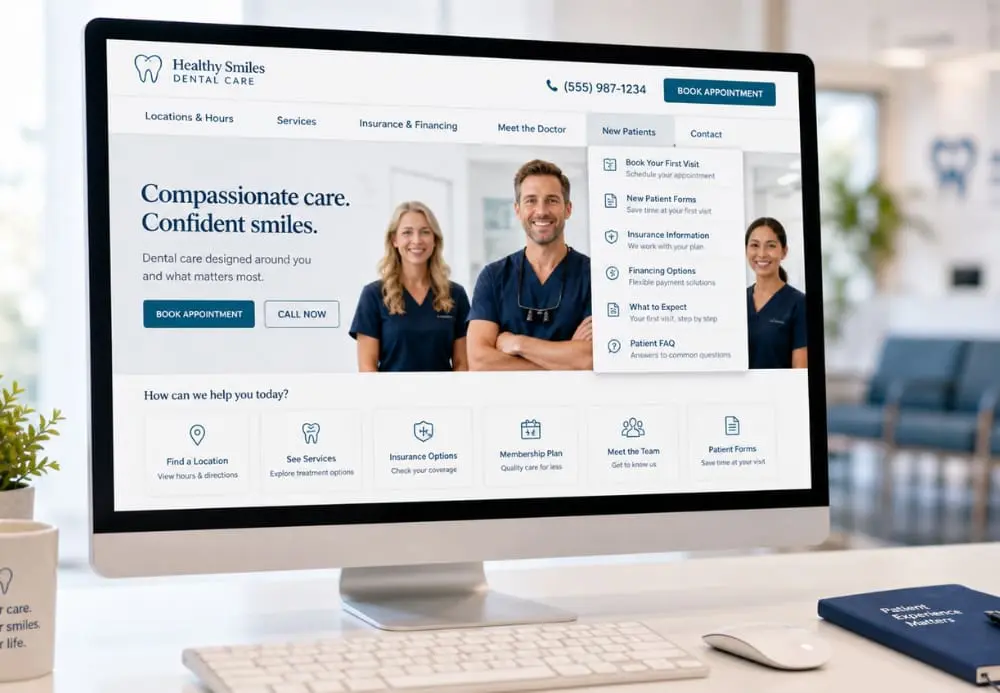
3. Organize navigation around patient tasks
Patients rarely land on your home page and think “I want to admire this design.” They are trying to complete a task. Common ones include:
- Find your locations and hours
- See if you offer a specific service
- Check insurance, financing, or membership options
- Learn a bit about the doctor and team
Sites in Bullseye’s Website Gallery that perform well tend to keep primary navigation focused on these tasks.
Drop downs are short and clear. Location information and phone numbers are visible on every page. New patient forms and portals are easy to find but do not block the path for someone who just wants to call.
4. Use real photography and social proof to build trust
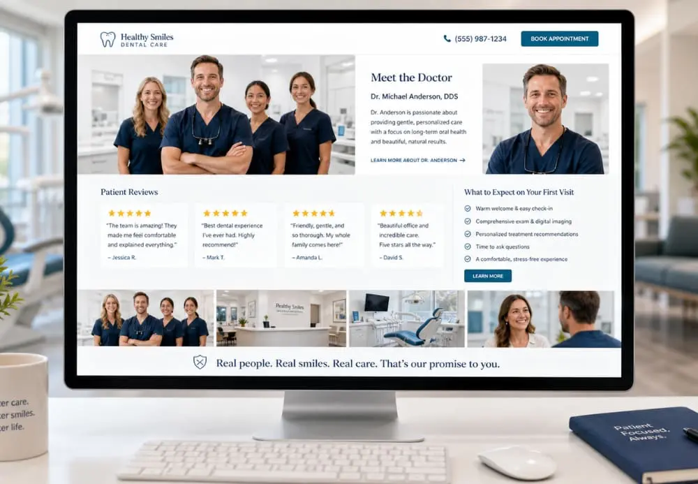
Design elements matter, but what often moves a patient from “maybe” to “yes” is trust. Real photography and social proof help a lot here.
Bullseye has already written about why professional in office photos outshine stock photography. Real images of your team, your space, and your patients (with consent) create a connection that stock photos cannot.
Pair those images with:
- Short, authentic patient reviews
- A clear About or Meet the Doctor section
- Simple explanations of what to expect at the first visit
The result is a site that feels safe, human, and honest.
5. Measure how patients actually use your site
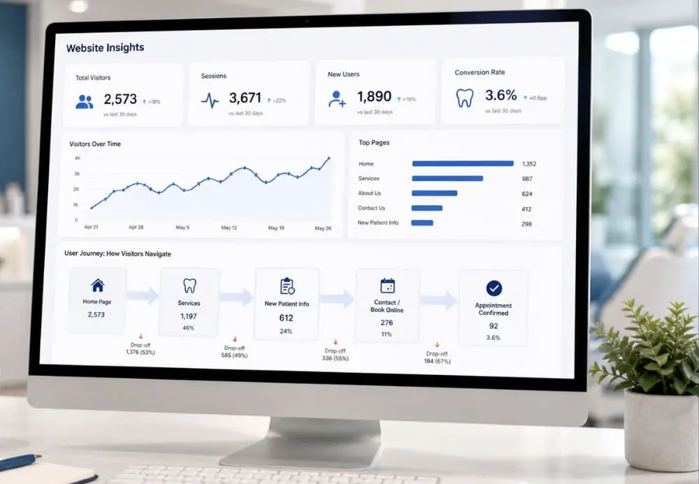
Finally, a website is never “done.” The practices that get the most value from their sites review basic analytics regularly. They look at which pages people land on, where they click, and where they drop off. That data informs design tweaks, new content, and future campaigns.
This is also where a complimentary marketing x ray can help. The team at Bullseye reviews your site structure, mobile experience, and conversion paths, then uses that insight to recommend specific changes and broader dental marketing services that fit your goals.
Bringing it together
Designing a dental website patients actually use is less about trends and more about clarity. Make it easy to see who you are, where you are, and what you do. Build the layout around real patient tasks. Use authentic visuals and reviews to earn trust. Then, keep an eye on how people interact so you can keep improving.
When your website works this way, everything else you do in digital marketing works better too.