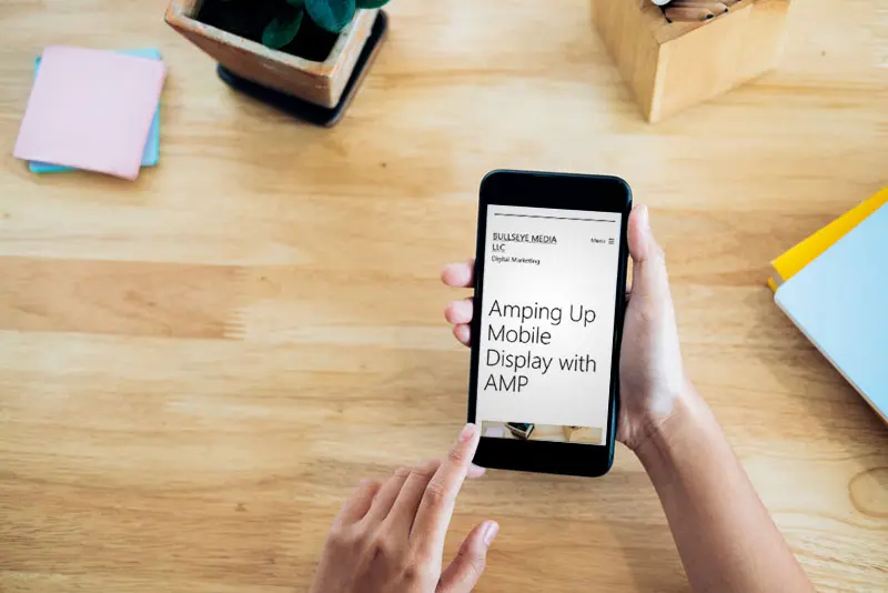
Apple famously coined “A thousand songs in your pocket” when they launched the iPod in 2001. We’ve come a long way in 20 years: now nearly all of your patients have the entire internet in their pockets (and hands), all day, every day.
We went from banking online at our computers to mobile banking. From making grocery lists on our phones to scheduling same-day pickups or deliveries. From calling a doctor’s office to filling out appointment request forms with our thumbs.
The mobile mindset has transformed almost every area of our lives. If you want to book a hotel room, schedule a hair appointment, or find a new dentist, you’re probably doing it on your phone while sitting in the carpool lane, waiting for your groceries to be loaded, or binging the latest Netflix show.
The mobile mindset is here to stay. Is your website optimized for mobile?
Is Your Site Optimized for Mobile?
Obviously, your site needs to be optimized for mobile viewing. This is a baseline standard we use at Bullseye Media for clients getting new sites.
One of the reasons the mobile mindset has taken over is its ease of use. Chances are if your site doesn’t display well on mobile devices, users are going to bounce by hitting that back button (or swiping back) and choose the next entry on the search results.
Mobile users expect your site to load as fast, or faster, than it does on a desktop. That means when your site loads on a mobile device, it can’t be slow, crash, freeze, or return an error.
When a patient or potential patient visits your site on their mobile device, it should be easy for them to read. No pinching the screen to resize, laborious scrolling, waiting on images to load, or sifting through text formatting that’s meant to be read on a monitor.
Sites optimized for mobile employ Responsive Web Design (RWD): essentially this means that when the site loads, it takes into consideration the type of device the site is being viewed on. More than simply flowing the text, RWD alters the aspect layout, making it easier to read on phones, tablets, or desktop computers.
If your site loads the same regardless of the device it’s being viewed on, it’s time for an upgrade. (If this is you, get in touch! We’d love to help.)
AMP: Beyond Mobile Optimization
Beyond the user experience, search engines play a massive role in mobile display standards. They want to deliver the best user experience possible, so they’ve set out standards for load speeds.
Google, for instance, requires a mobile site to load in 3 seconds or less on a 3G connection. That’s a high bar, but it’s one of the key factors in making users stick instead of bounce.
That’s good for Google—they’ve delivered a quality search result. And it’s good for your practice—users are staying on your site and more likely to convert (aka contact your office).
How do mobile sites meet these stringent standards? Enter, AMP.
AMP is an open source tool supported by Google. Sites using the AMP framework for mobile create a stripped-down HTML version of your site made specifically for mobile viewing. Display, text formatting, and images are all optimized. This is a quick fix that makes Google happy (it’s easier to index) and keeps users on your site longer.
Benefits of AMP for your site:
- Faster load times on mobile
- Helps site rank better in search
- Easier reading for users
- Better chance of showing up in featured snippets on mobile feeds
AMP for Bullseye Media Clients
At Bullseye Media, we optimize clients’ sites for mobile, and those signed up for blogs automatically receive AMP versions of their blogs, boosting their return on mobile viewing.
See the image below. This client’s blog posts load 94% faster on mobile with AMP.
If you’re looking to improve your website’s performance (desktop or mobile), get in touch. We’d love to help you drive new patient growth.
IMAGE: The Time to Interactive metric (the time it takes for a user to actually be able to use the page) is nearly 11 seconds faster with AMP.
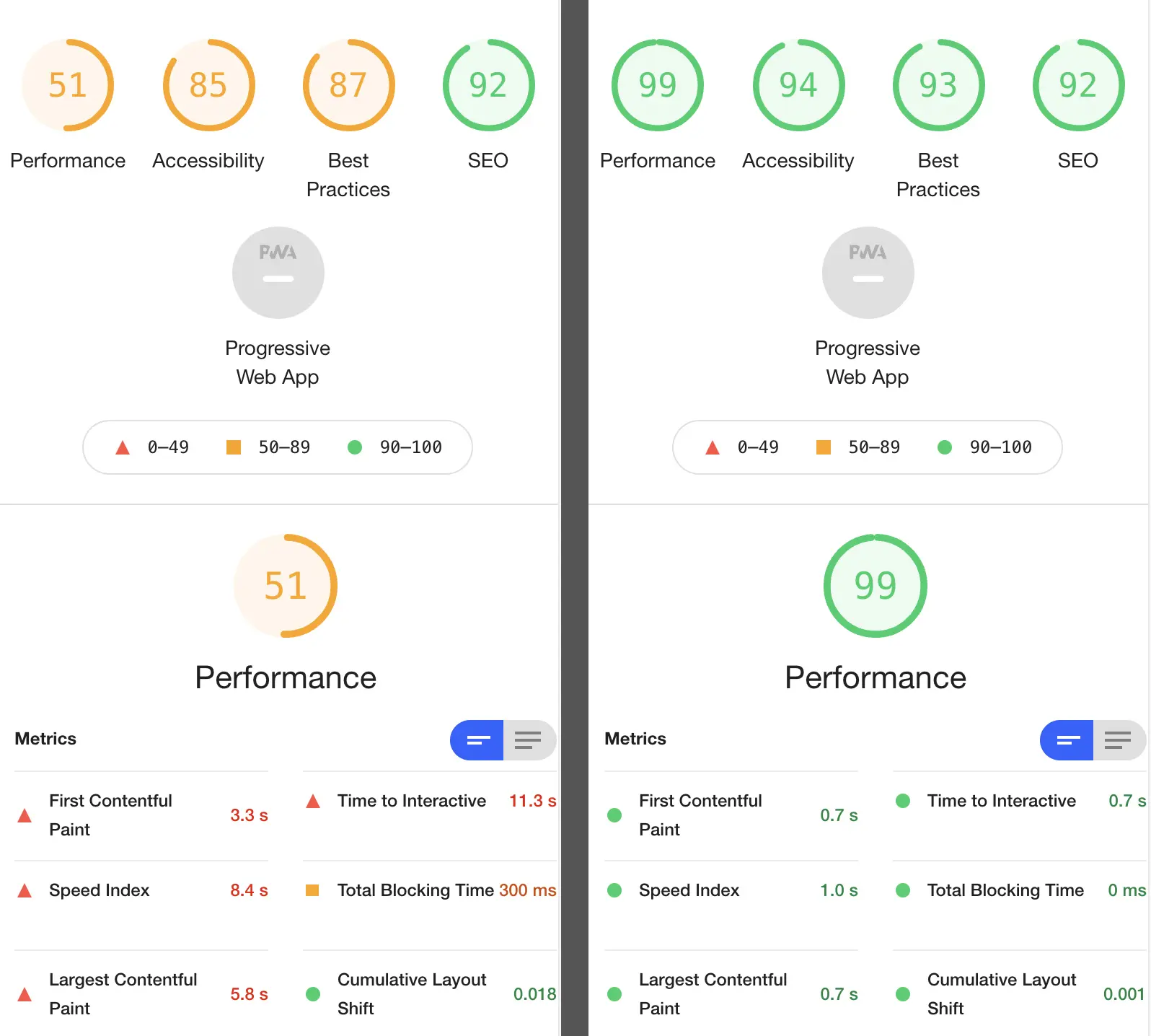
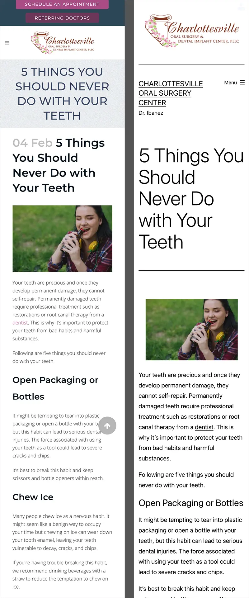
IMAGE: Side-by-side view of a blog without AMP (left) and with AMP (right).


