Bullseye Media logo - all white

Best Dental Websites of 2022

Our Top 5 Winning Dental Websites of 2022

In this week’s blog post, we are going to highlight five of our favorite dental websites of 2022 and explain why we think they are the best around.

That’s not to say that the rest of the websites we built for our clients last year aren’t award-winning quality because they are! We just like to keep our blog posts short and to the point at Bullseye Media, and “Top 5” always seems to work well. So here we go…

Dr. Cowdin felt it was time to redesign her website, and we wanted to make sure her new one really popped! She provided gorgeous professional photography of her office and staff, which always helps personalize a site. We made sure the branding was consistent throughout, including using the same fonts from her logo for headlines and accents. We particularly love the smile gallery on this site. It is easy to navigate and is organized by the most common pain points that many of her patients experience.
Next up is Dr. Johnson’s website. Doesn’t he look like the friendliest dentist you could ever meet? Ah, that’s why he is front and center on the home page! One of his objectives was to communicate to prospective patients that he and his team truly care about the health of their patients and their community. We achieved this goal by highlighting professional photography of him, his team and his office, incorporating soothing earth tones into the site design and strategically organizing the content for clarity. The practice overview video, which includes wonderful patient testimonials, is also an inviting touch!
Bliss Dental loves bright, bold colors and wanted us to build a fun website that shows they enjoy seeing patients of all ages. Content organization was key for this site build, as they have a lot of great information that is important for potential patients to see, such as contact information for both practice locations, new patient forms, testimonials, a smile gallery, and that they offer extended hours and weekend hours. We also highlighted their patient specials and a membership plan to make treatment easier and more affordable for patients. Whew, that’s a lot! And it’s all displayed on the home page in an attractive and cohesive way.

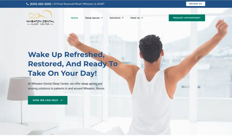
Over the years, we have become quite the experts at building websites for our dental sleep clients, and Wheaton Dental Sleep Center’s site is one of our recent favorites. Rather than focus on the problem in the hero section of the home page, we decided to take a different approach and present the positive result of sleep apnea treatment: Wake up Refreshed, Restored and Ready to Take on Your Day!

The content on sleep sites is especially important since many patients don’t fully understand sleep apnea, why it’s harmful, and how to treat it until it’s explained to them. Therefore, we always do our best to organize the content so that it is informative, yet engaging. We love that the steps to get started are outlined on the home page, and there is also a page that clearly explains the treatment process. The fun, interactive animations are also a great addition!

We like to use this website as an example when we discuss the ideal home page layout to new clients. It includes all the information that a prospective patient would want to know about the practice: location and contact information, the top reasons patients choose Grand Avenue Dental, office hours, patient specials / membership plans, dental services offered, patient reviews and information about the doctor. Not only that, but it is clearly communicated along with their main message: Dental visits are not unpleasant, uncomfortable or intimidating at Grand Avenue Dental!

After reading this article, do you think your practice could benefit from a new website? Contact us today! We’d love for your site to be chosen as a Top 5 favorite in 2023!

Share :